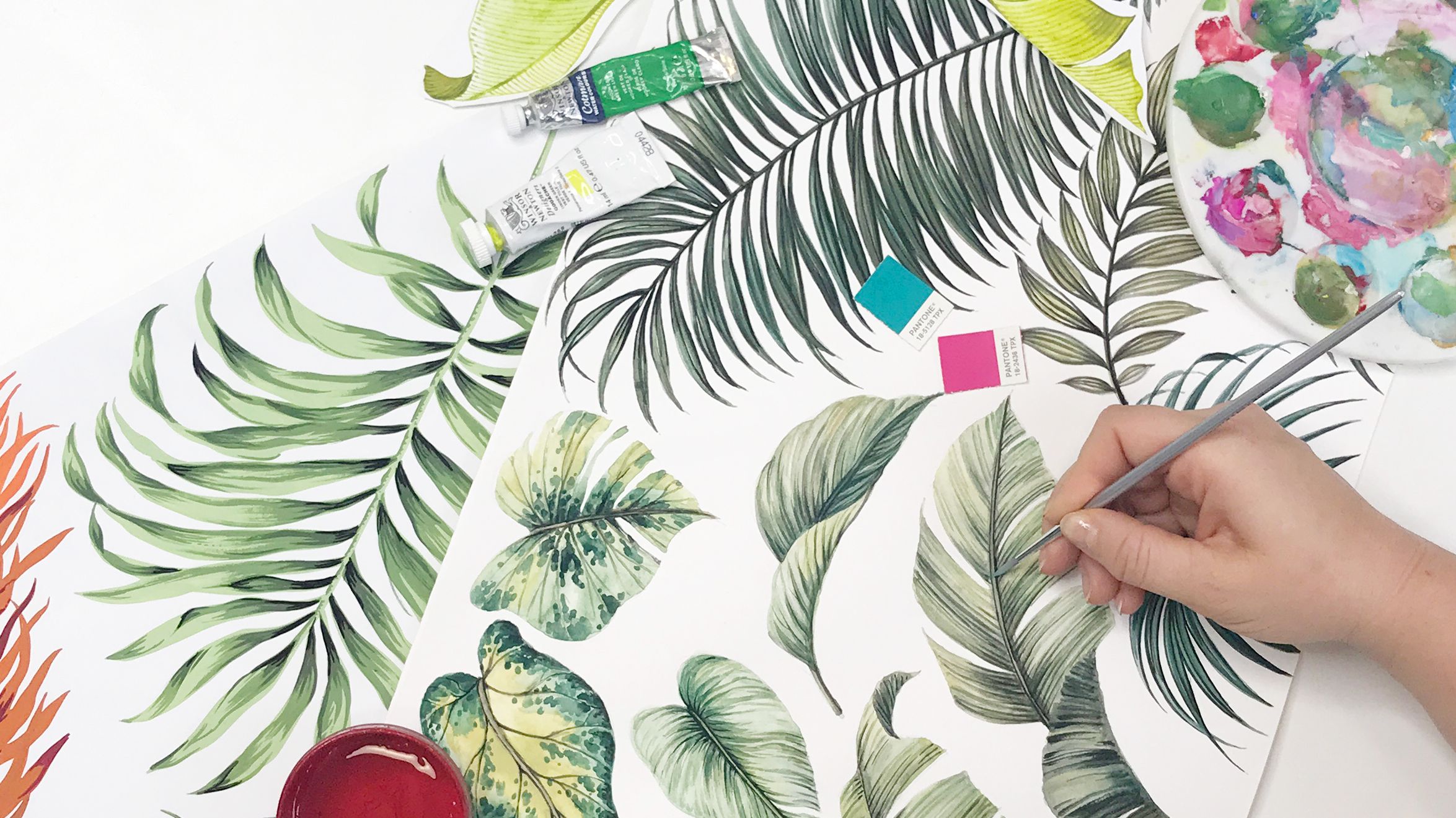
Colour Separation for Textile Design
Master the Photoshop process AND the client conversations that make you the designer they trust.
Start Course NowPermission to charge for colour separation. This isn't just a technical course. Learn how to guide clients through production realities, know when to separate and when to push back, and position yourself as the designer who understands the full chain - not just the artwork.
What is colour separation?
Colour separation is the process of breaking your design down into individual colour layers. Screen and rotary fabric printing is printed one colour at a time, so each layer needs its own screen, and each screen costs money. The more colours in your design, the more expensive it is to print.
That's why colour separation often means reducing the number of colours to keep production costs down. But not every design should be colour separated, and we'll show you why.
This is a full creative-to-commercial workflow taught by industry experts who know exactly what brands look for.
Colour separation comes up constantly, from clients, from students, across almost every course we run. But knowing how to separate is only half the skill. Knowing when, why, and when to recommend something else entirely is what separates a designer clients come back to from one they don't.
Learn Alongside 2,000+ Designers Around the World
You're not learning alone. You're joining a thriving community of textile and surface pattern designers who are pushing their work further, monetizing their designs, and becoming the trend-setting designers brands actually want to work with. Get expert feedback, share your work, solve problems in real time, and watch how other designers tackle the same challenges you're facing.
Taught by the Studio Designers of Longina Phillips Design
This course is taught by the design team at Longina Phillips Design, based in Sydney, Australia. With over 35 years of industry experience and more than 3,000 fashion & lifestyle clients, we know exactly what works, and what doesn't. We’ve built color separations for the biggest names in the industry.
Working with global brands like Zimmermann, Aje, Anthropologie, Gap, Kookai, Scanlan Theodore, and more.
What that means for you:
You're learning the exact process used by working designers who deal with colour separation requests every single day. Not theory. Not guesses. The real workflow from a studio that's been doing this successfully for decades.
The Three Things You'll Master...
Phase 1: THE BUSINESS CASE
- How every colour requires its own screen (and why that matters to your client)
- The real cost conversation: what to charge, how to position it, when to push back
- How to read a design and know instantly if it should be screen printed or digitally printed
- How to frame colour separation as the specialized service it is
Phase 2: THE PHOTOSHOP WORKFLOW
- How to colour separate a simple, flat design with confidence
- How to handle complex multi-colour designs (the back-and-forth is normal)
- Advanced techniques: fuzziness sliders, expand vs. smooth, when to cheat
- How to build files your clients can actually use
Phase 3: KNOWING WHEN NOT TO:
- Why watercolours almost always need digital printing
- Which designs are too detailed or too fine-lined for screens
- When to recommend digital vs. sublimation printing instead
- How to position this as expertise, not a limitation
You Will Also Learn to...
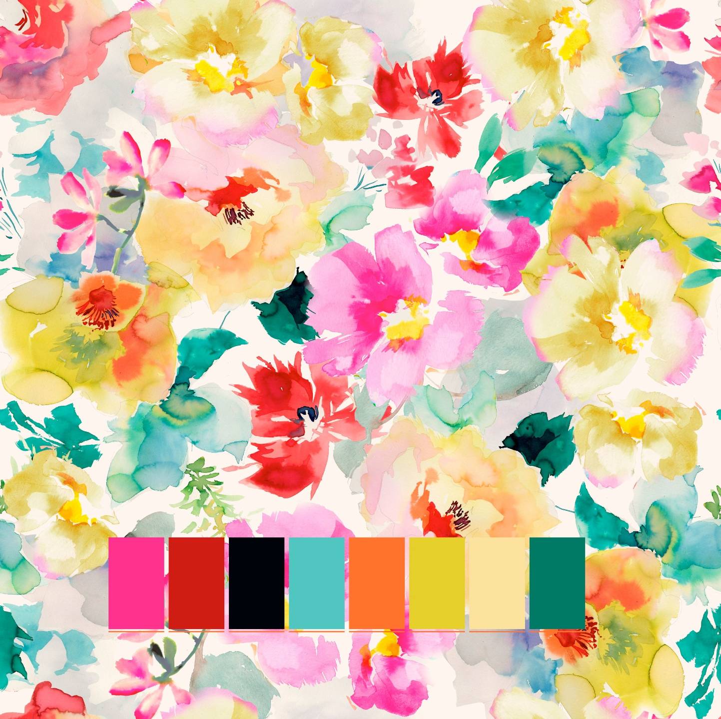
*Make colour swatch tabs so you know exactly what you're working with
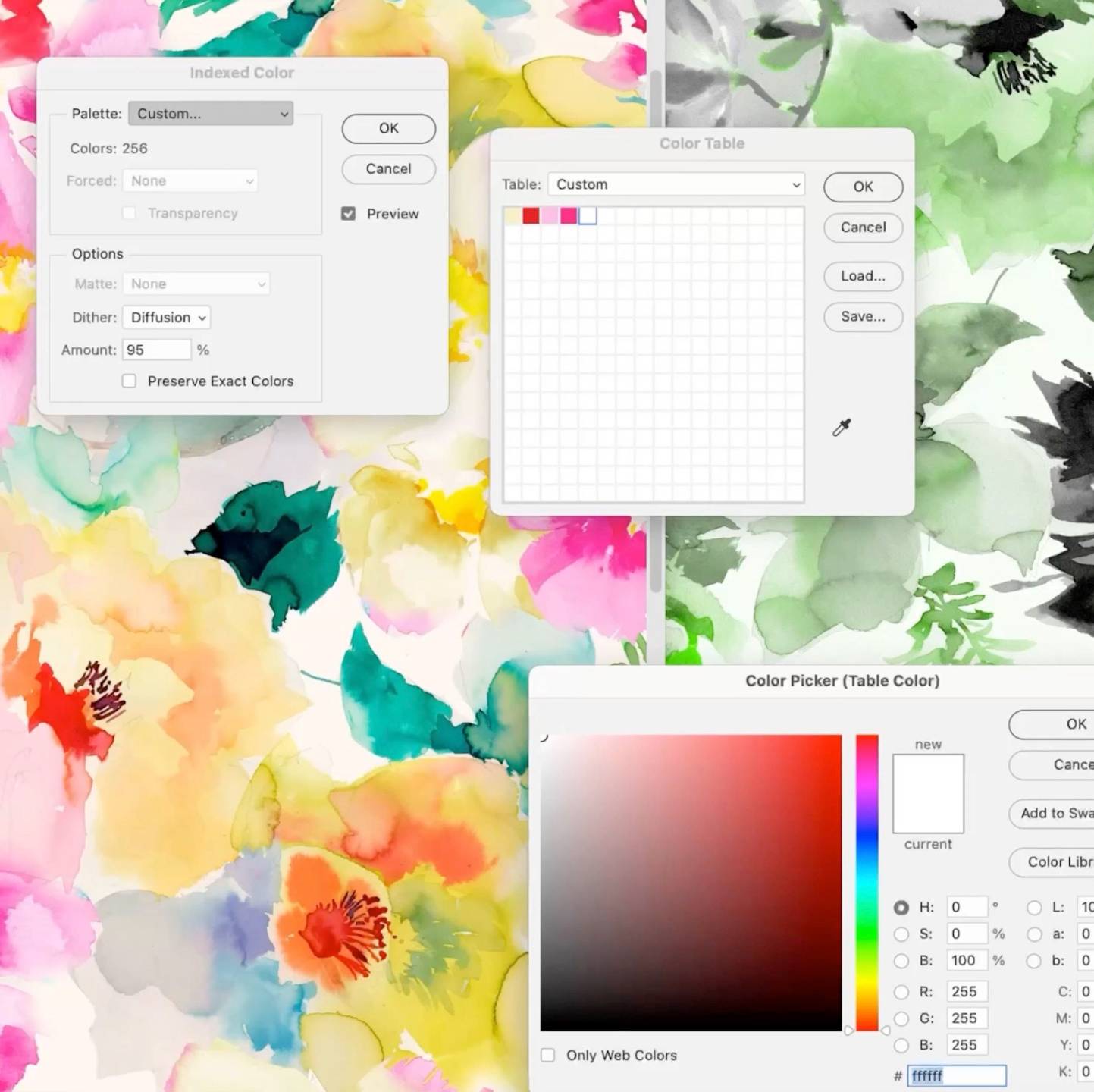
*Use index colouring to reduce chaotic designs down to printable colours
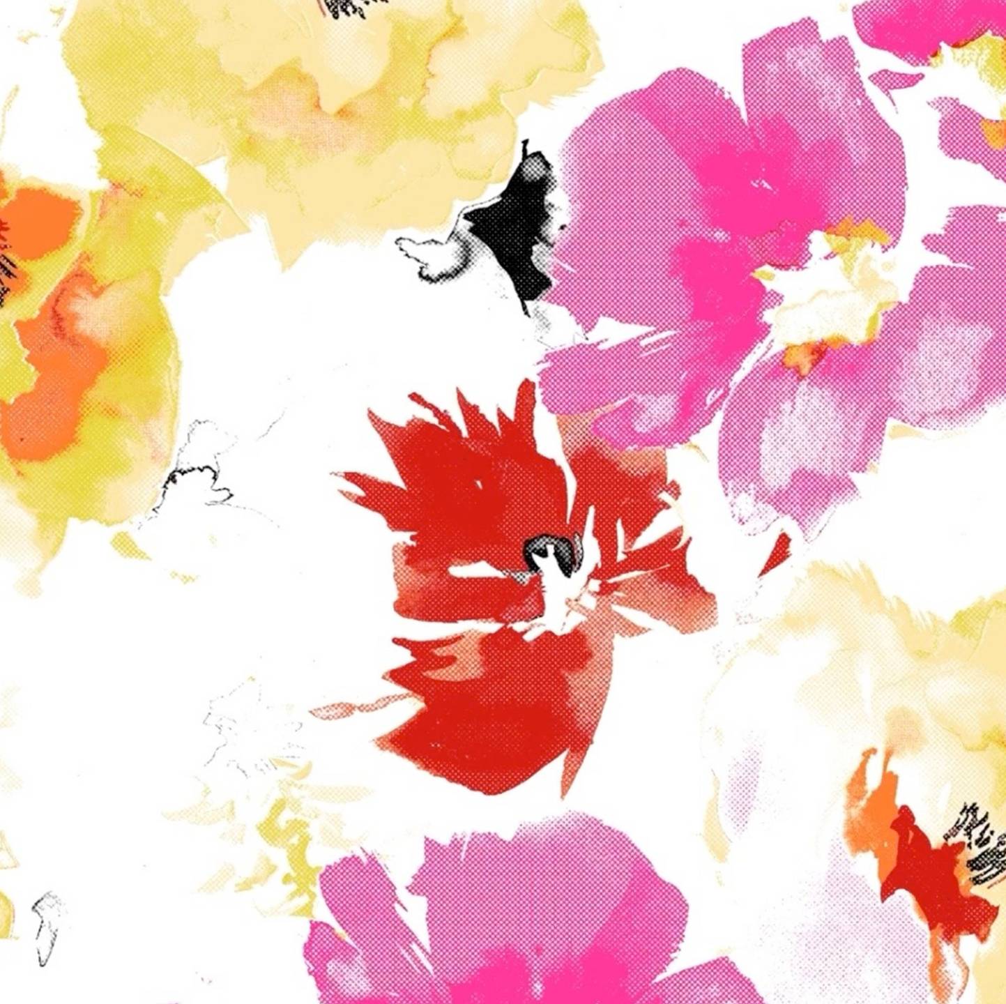
*How to create 1/2 tones with Bitmap steps
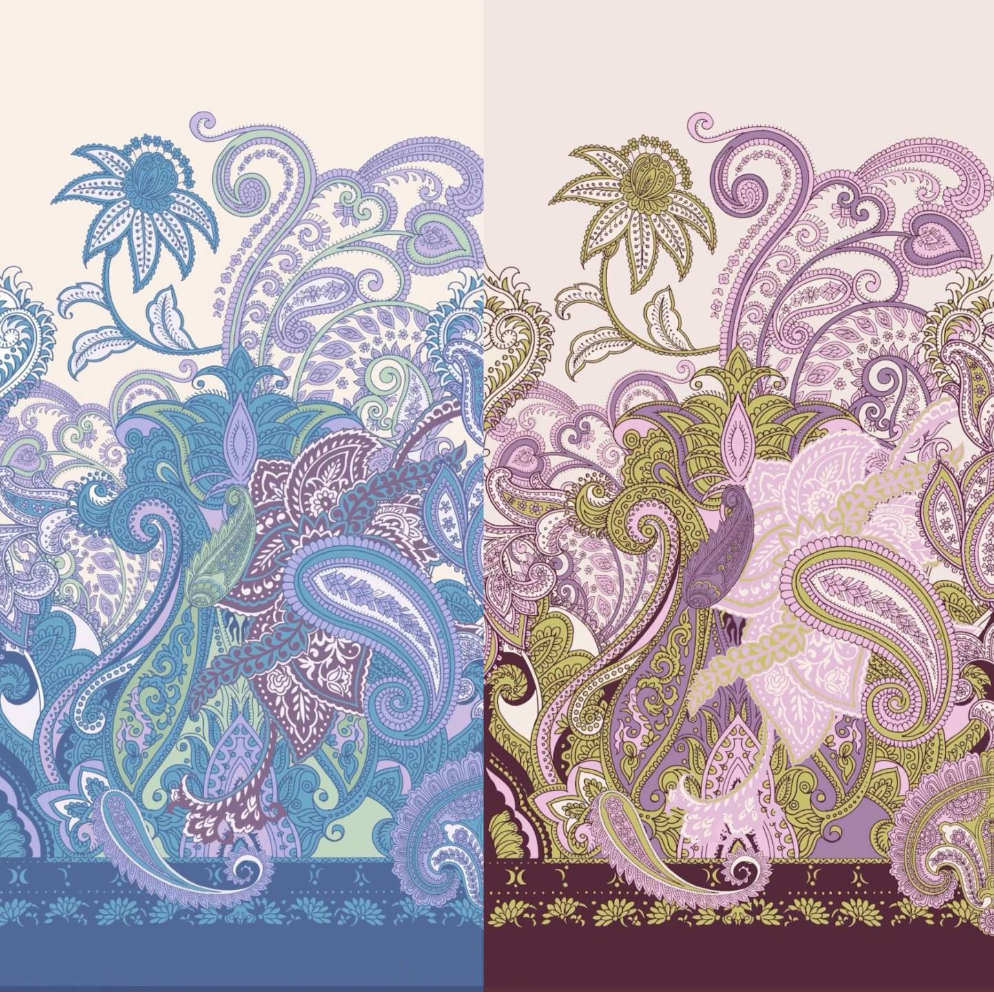
*Create colourways that let clients see their design in different colour combinations

*Talk to clients about trade-offs, cost impact, and production reality

*Charge appropriately - colour separation is a service, not part of your core deliverable
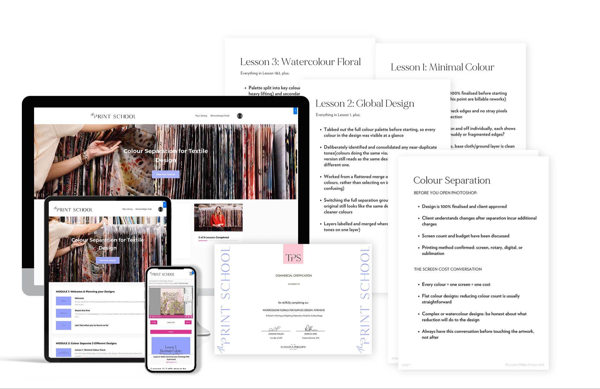
Plus!

Expert and Peer Support
Access our community group where you can seek additional guidance from instructors. Fellow students are also there to support you on your journey as they navigate similar experiences.

Knowledge Hub Access for life
Discover insights on topics you never considered asking about before! An expanding resource that addresses challenging inquiries.