Studio Critiques | What's Wrong with This Tropical Floral?
Jun 01, 2023Hi, everyone. We are going to be discussing this very first tropical design that one of our designers has been working on. So we are working quite heavily towards swimwear at the moment. We have a big show coming up in Paris where we sell a lot of swimwear designs. So we're really focused on making sure we've got beautiful, happy colors for swimwear and really great vibrant designs.
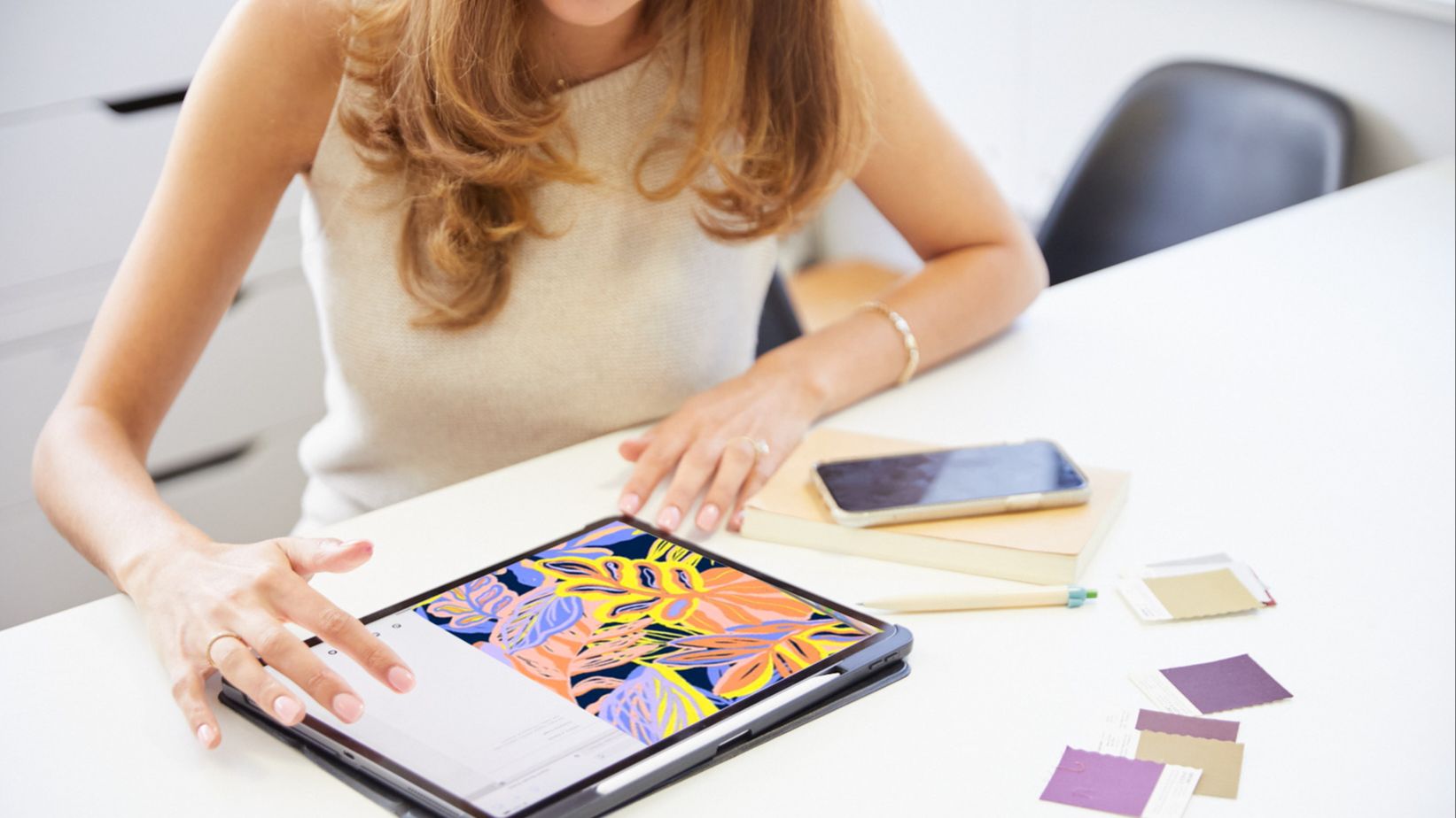
So this one was done for a very free-forming tropical leaf story.
And you can see here that the designer has done a great job with color, super commercial. I especially love this green and pink combination. It's really happy. It has white in there for freshness, which is really important for swimwear. So I think the only issue I would have with this design is that it's a little bit messy.
So she's done this on the iPad, which is fine.
No problems with iPads as long as you don’t do everything in Procreate. As long as there's variety within your designs, it's fine to use Procreate every now and then. But what happens with Procreate is when you're creating this textural kind of motifs, the background is missing. So you can see in here she's getting that pink leaf from behind coming through this green leaf just here.
Now, that can get quite problematic, especially for swimwear, where you're looking at a bikini bra just falling in this position here, that's going to be quite messy. So with swimwear, you're focusing on a small garment in a section of a design. So each part of the design needs to be really neat and not messy. The problem with getting these background motifs showing through foreground motifs is you get all these things that I call “bitty bits.”
So bitty bits are just bits of motifs or space that come through and there's a lot of them and they make a design busy and messy.
And so that's what I would advise with this design we need to clean this up so that the background motif isn't showing. So what she should do is fill this yellow leaf in so it hides the motif behind it.
Also with texture, it's important that a lot of customers will buy a design and then want to take the texture away afterward because they want it to be clean. So if we can, depending on the type of design, of course, sometimes a texture can be an overlay over the final design that can easily be removed. It's just a layer in itself and it can be removed, switched on and off, and therefore you're pleasing the customer and you're still getting the look that you're after with the texture. So that would be a bit of advice.
So with these things, these sorts of blotchy little spotty textures that you're getting in here probably should be a layer on top. Unless it's painted within the design, then I guess it's okay sometimes. Every design is an individual design and needs to be approached as such. So you need to think about what you're going to do for that design at the time you're doing it.
So yeah, there's a couple of little areas where there's a little pixel sort of edge.
I would ask her to sort of clean that up. We just want to make sure that there's nothing that is going to make our customers come back and ask us to fix things. We want them to be able to get a file and for them to be able to run with it. It's perfect. There are no issues.
Okay, so the other thing I advised was this leaf here, this big leaf.
Now this canvas size is actually 75 x 45 centimeters. So when it's printed to the fabric, it's actually quite big, which means that this leaf is almost going to take up an entire torso. It's so big. So things like that, when you're working, especially on a laptop or a tablet, it’s so important to check your scale as you design because you can end up with some massive strange motifs that are just not right for the end product. So I have asked her to reduce the scale of this and also just clean it up a little bit. It's just a little bit messy. You know the lines aren't particularly stylized, so cleaning that up also this leaf down here is getting a little bit scratchy. So just cleaning things like that up.
A customer would stop at this design.
So when we’re showing a collection of designs. You know, they're looking at hundreds of designs, so you want to be able to get their attention and the first thing that's going to get their attention with this design is the color because the color in both colorways is so vibrant and happy. So color can and will sell your design. They will probably buy this design because the color is so great.
And so then I guess when you look at the colorway, that's when you can really see those little bitty bits coming through that need tidying up and here you’re getting all those little messy bitty bits coming through in this leaf here, so we would just want to make sure that it's all tidy and there's no kind of scratchy bits in the design.
So it just really needs refining, really the color’s beautiful.
It's super commercial. It would work for kidswear, it would work with swimwear. We can see it across multiple products, which is great. It means when we're showing our 2,000 clients or they're looking online, it's going to appeal to quite a few of them for their product.
So that's what we really want to be able to achieve. Okay, and we'll move on to another design.
 .
. 
 .
. 
Stay connected with news and updates!
Join our mailing list to receive the latest news and updates from our team.
Don't worry, your information will not be shared.
We hate SPAM. We will never sell your information, for any reason.