7 Surprisingly Effective Watercolor Tips Our Designers Needed to Hear
Nov 17, 2022Recently the big boss, Lola, invited a watercolor artist to teach our professional watercolorists to err.. paint in watercolor. And for a very good reason. Keep reading to find out why!
"We should 'feed our creativity' constantly, no matter what stage of our career," she says.
"Watching someone else paint inspires our creativity. That 'someone else' may use a different technique, different tools, composition and materials and by watching we get that 'ah ha' moment that is so inspirational."

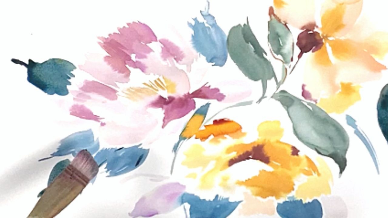
So she asked Sydney artist, Susie Murphie, to come to the studio and show the designers how she paints watercolour blooms in her loose and gestural style.
Here's what they took away from the workshop:
1. Stamp out the water
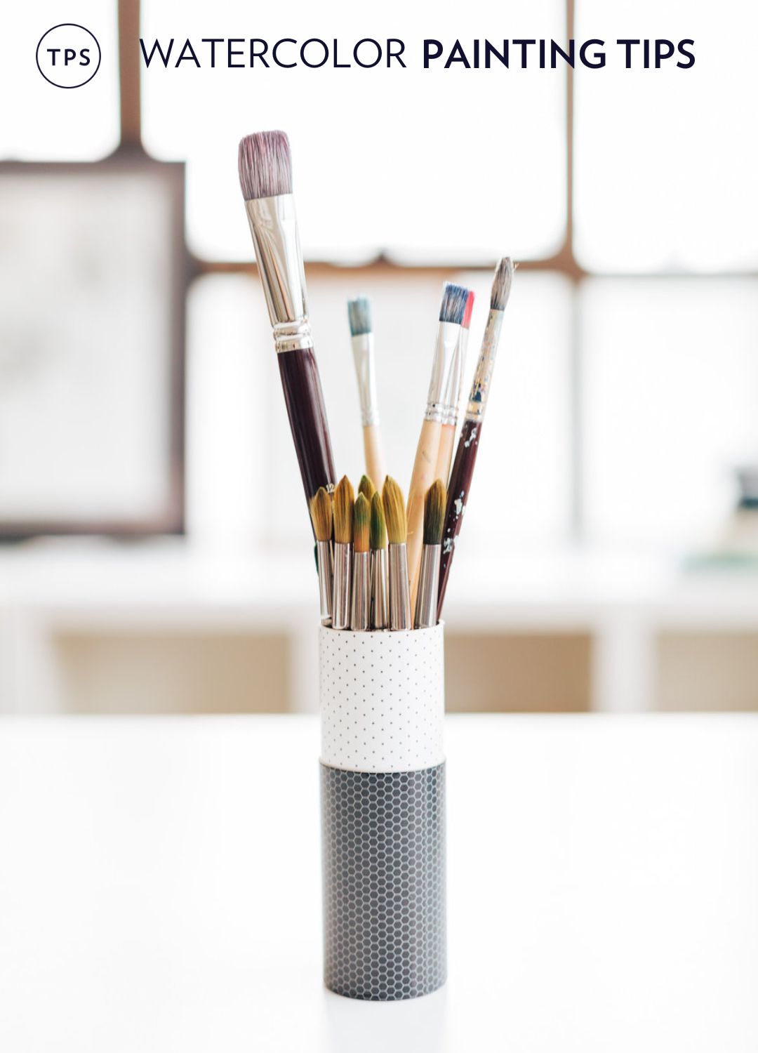
Stamp out the water on your brush before applying it to the paper or palette so you don’t drown your paints. - Phobe, Junior Designer
2. Create a “creamy” consistency
Create a creamy consistency with the paints on your palette to optimise pigmentation. If you want to make it more transparent apply more water onto the paper. More water equals more transparent. - Phobe, Junior Designer
3. Don't paint over dry paint
Don’t paint over the painted areas once they dry. It will make the paper muddy and pill the paper. Apply more colour when damp. - Phobe, Junior Designer
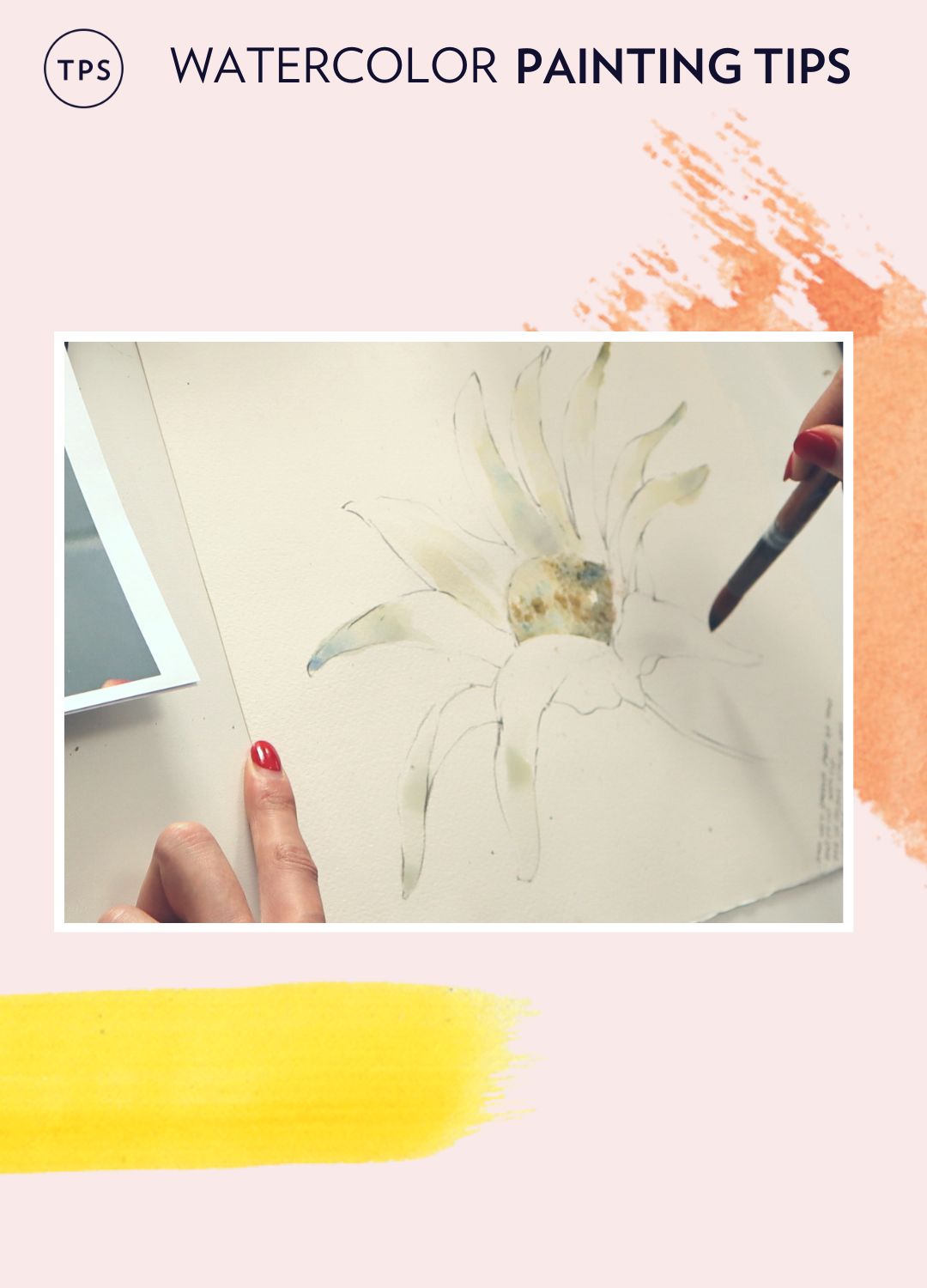
4. Always look at the negative space
What really stuck with me, was when she was discussing negative space and how you can use that approach when drawing something more complex, say like a jar of brushes. It makes it feel less daunting. - Bec G, Designer and Administration Assistant
5. Use the flat side of a brush to paint petals
How to hold your brush when creating petals. Using the flat side of the brush rather than the tip gives you a different look altogether. - Lyndsay, Senior Designer and Creative Lead
6. Look at your subject upside down
Drawing without any preconceptions about what the object you’re drawing should be. Achieve this through drawing upside down and looking at the negative space. Lyndsay, Senior Designer and Creative Lead
7. Don't be afraid of the process
Not to be so delicate when mixing paints or using your brushes. - Stephanie, Senior Designer
----
You might also like...


Stay connected with news and updates!
Join our mailing list to receive the latest news and updates from our team.
Don't worry, your information will not be shared.
We hate SPAM. We will never sell your information, for any reason.
