
Fashion Trends SS23 | Make Boring Colors Shine in Your Surface Designs
Oct 20, 2022The last model walked the Spring Summer 23 runway a few weeks ago but we are (and will be) pouring over the collections for many months to come.
While there were lots of shareable moments, we noticed one overriding colour trend: wishy-washy, subdued hues. As print designers, we were more than mildly disappointed to see these shades, such as dishwater blue and dove grey, star in so many shows.
The season’s dull delivery might be especially shocking in contrast to the last lot of shows in Fall Winter 23, which saw Valentino light a fire of fuchsia down his runway.
But, to save us from designing every print in Pantone Pink PP by Valentino for the foreseeable future, our creative director, Bec is here.
She’ll show you how to make those dreary hues look positively pretty, keeping your collection both on trend and full of commercial appeal.

But before we get into it, we are dying to tell you about our new color course, Color Theory and Photoshop for Surface Designers. Color plays such a huge role in all areas of design, but until now, there hasn't been a lot of training specifically for the surface design industry.

As surface designers we know colors don't always cross over markets. For example, would you use the same colors for bedlinen as you would a bikini?
We show you how to translate your platte plus how to edit it inside Photoshop.
Now, back to your tutorial!

1. Pale Butter
Keep the color highlights on the opposite side of the colourwheel. See how the Y2k greens give it life, even though they are also pastel?

But if we keep it tonal with the pinks and oranges, it's a bit boring.


2. Brown
"Even the name is dull, but it's back in a big way thanks to 60’s, 70’s and 90’s/2000’s revivals. But how can you make a brown floral look good?"
Tip #1 Avoid ‘shmear' type elements in your designs. That means no brown dry paint strokes, brown tie-dyes or any kind of bleed paint effects in brown. We know you know why.
Tip #2 Give it a contrasting color pop. We love what Tory Burch has done in plains, lets's see if it works in print too.

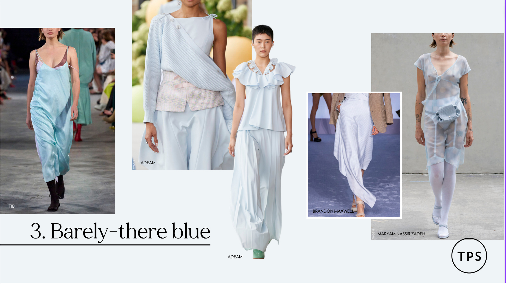
2. Barely-there blue
It's so important to consider the base cloth your print will be printed to. As our headers are on a semi-sheer silk twill, pastels can easily get lost. So how do we make them work in a print knowing they’ll be much flatter on fabric than on our computer screens? We up the contrast, so that when it does transfer to fabric, the end result is pastel.
Also, the colors you place side-by-side with your pastels are key. They need to have more depth or contrast so that when they print to the fabric they can be seen and it not all just blend into one boring design.


4. Chartreuse
A very trend-driven colour, we don't see this hue every season. With all things Y2K back in we’re seeing these shades of lime everywhere. So how do you make it not look like prints you designed 20 years ago or prints you saw your mum wear!?
Put your old perspectives to the side and see them with 'NOW' eyes. Contrast it with something stronger like black

or contrast it with the opposite, something soft and pretty.


4. Grey
A hard color to make exciting, so we approach it like we did chartreuse. Pop a pretty tone in there to give it some life.


6. Mushroom
Give it a pop, but be careful not to overdo it. Here we’ve balanced it out with another pastel.


7. Olive
This color can go a little masculine for some brands, so let's embrace the Valentino pink and electrify the design with it.

 8.Taupe
Probably the dullest of them all, but taupe is a top seller. We make it modern by looking to the past. 2000s aqua and lime make this design youthful.

----
You might also like...
Create an Easy Repeating Pattern with Photoshop
What is Surface Pattern Design
Watercolor for Beginners - Do's and Don'ts
How to Design Fabric for High-End Brands
Stay connected with news and updates!
Join our mailing list to receive the latest news and updates from our team.
Don't worry, your information will not be shared.
We hate SPAM. We will never sell your information, for any reason.
