As a studio, we use Photoshop as it allows our designers to have the most creative freedom when it comes to editing and manipulating their prints.
So a good time to use Illustrator is when you want to create vector-based artworks. So they are shapes that use points and anchors instead of pixels. So it means that they are infinitely scalable. So a good time to use Illustrated would be if you're doing a Pucci print or maybe you're doing a Geo print that you don't know what the scale of it might be. So it could be put on a billboard. And in that case,...
Whether you are starting your texture library from scratch or building upon an already well-furnished folder, check out creative director, Bec's suggestions for using texture in 2023.
You can get so much mileage from a few tie-dye textures. Cut them up, make new variations of them, and create more stylized tie-dye designs like the Ulla Johnson pre-fall examples. Or strip them back and use them as a non-print print for a more sophisticated market, home, or menswear (Scotch and soda).
Clockwise from Top: Ulla Johnson, Raquel Allegra, Scotch...
Materials can dwindle quickly in our commercial studio of 15 designers. And, like you, we’re on a budget. If there’s anything we can do to get the absolute most out of a tube of paint, brush or pad of paper, we will!
So here's how we rein in our art supply spend, in hopes to get you through this holiday season with piles of beautiful, completed work and your credit card in one piece.
Unlike acrylic or oil based paints, when a blob of gouache or watercolour dries on your palette, you can use it again. Wet it...
Images of plants and flowers are so readily available that we tend to rely on them a lot. But, while using a picture of a flower as a reference is a time-saver, drawing from nature provides us with so much more information about the subject.
So, it's time to head outdoors! Here's Kat's top four tips for flower gazing in RL.
Words by: Katrina. The Print School Instructor
One of the greatest things about working ‘en plein air,’ is the opportunity to capture the essence of the flower or the gesture of the leaves without getting too caught up in the detail.
We tend to work more quickly as time is limited and, without the comfort and familiarity of the studio, our habits are...
"We should 'feed our creativity' constantly, no matter what stage of our career," she says.
"Watching someone else paint inspires our creativity. That 'someone else' may use a different technique, different tools, composition and materials and by watching we get that 'ah ha' moment that is so inspirational."
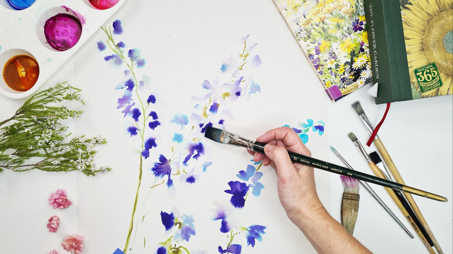
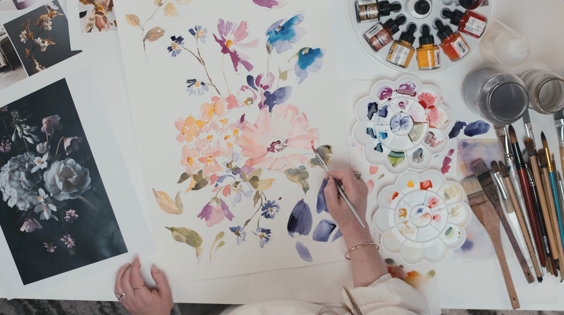
So she asked Sydney artist, Susie Murphie, to come to the studio and show the designers how she paints watercolour blooms in her loose and gestural style.
Here's what they took away from the workshop:
1. Stamp out the water
Stamp out the water on your brush before applying it to the paper or palette so you don’t drown your paints. - Phobe, Junior Designer
2. Create a “creamy” consistency
Create a creamy consistency with the paints on your...
Tactile fabrications are key, with lace, crochet and rope-type fabrications across a myriad of designers and cities.
We know this is not a print trend per se, but it's still a surface pattern and not to be ignored. When we see something across so many collections, we know it's going to be huge, and that we should incorporate it in some capacity in our collections. It might be as a background texture, behind a floral or a stand-alone printable crochet. ...
The season’s dull delivery might be especially shocking in contrast to the last lot of shows in Fall Winter 23, which saw Valentino light a fire of fuchsia down his runway.
But, to save us from designing every print in Pantone Pink PP by Valentino for the foreseeable future, our creative director, Bec is here.
She’ll show you how to make those dreary hues look positively pretty, keeping your collection both on trend and full of commercial appeal.
But before we get into it, we are dying to tell you about our new color course, Color Theory and Photoshop for...
Read on and favourite this page for future reference!
Bec: Good question. If your style is naturally very detailed, you would just take that across into your skins where you might use more detail in the hair of the skin or the movement, you'd be more detailed in the way you draw a flower.
If you are very loose and abstract you would still take that same handwriting into paisleys or animal skins. I think it's just practice and finding the right methods for your handwriting. What do you think Lola?
Lola:...
Tutorial by Lyndsay, Senior Designer
Here we break it down for you in 5 easy steps.
Start by creating a bunch layout in the centre of your art board. Make sure there’s some bare canvas around it.
You can see that this flower is hanging off our canvas at the bottom so to make this repeat work, it will need to reappear that the top of the canvas.
To do this, duplicate the motif then use the x and Y axis in the toolbar to move it north exactly the length of the canvas. This canvas is 64cm, so you’ll see me type -64 into the Y axis to move the motif 64cm exactly north.
TIP: Make sure that the triangle in...
Words by Erin, Digital Design Media Manager
When we stumble on a successful approach to well, anything, it’s natural to want to repeat it. Maybe there was a design style that sold really well for you last season and you’ve reinvented it few times since. You have the formula down and now it’s fast to produce. You’re moving at a rapid rate but your work is starting to feel too familiar. “There’s a lot of competition for textile sales out there and if you are not providing enough variety then your designs are not appearing new” says creative director, Rebecca. “Customers always want the ‘newest and...
50% Complete
Lorem ipsum dolor sit amet, consectetur adipiscing elit, sed do eiusmod tempor incididunt ut labore et dolore magna aliqua.