


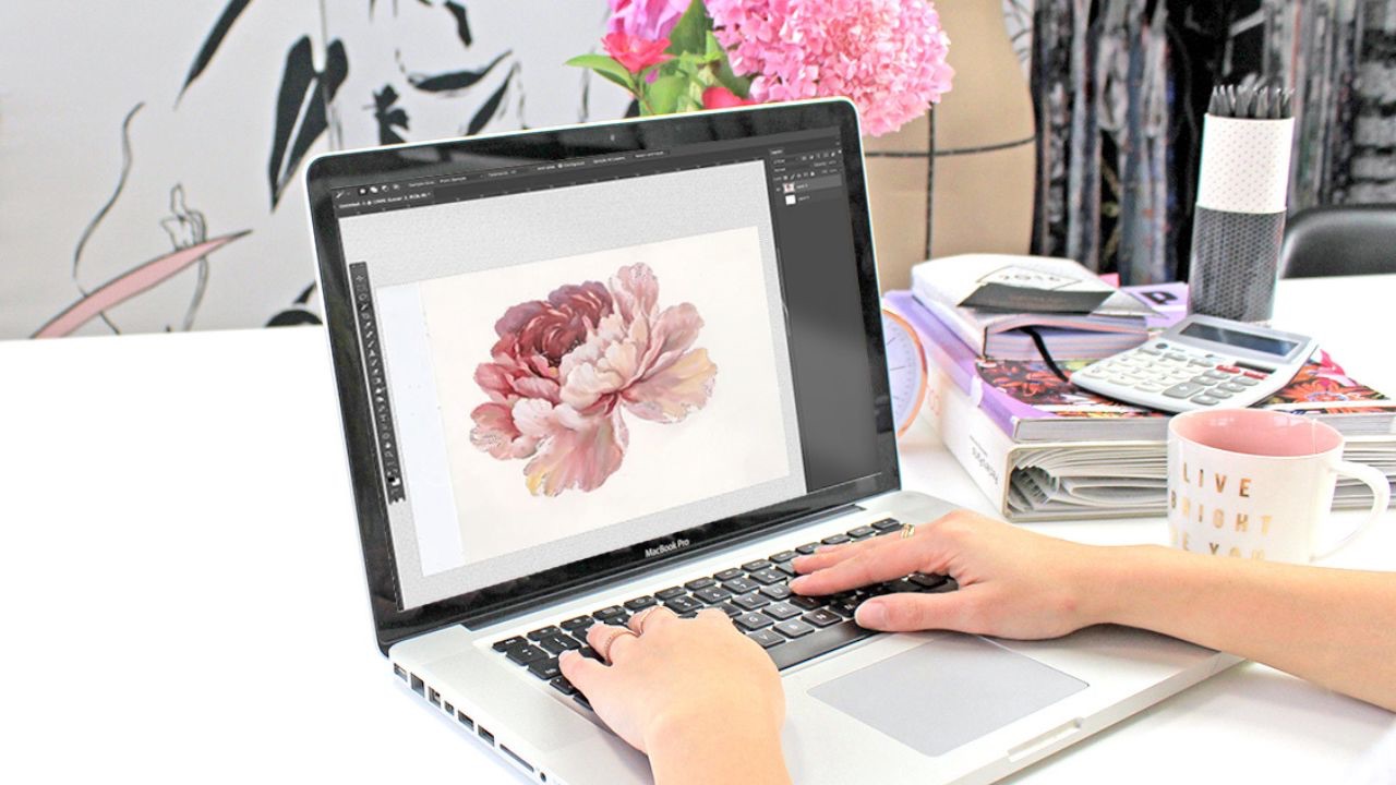
Inside a Surface Designer's Workflow
Jul 03, 2024


How to Draw Better Flowers Vlog
Jun 13, 2024

24/25 Runways: The Print Trends Selling Now
May 17, 2024
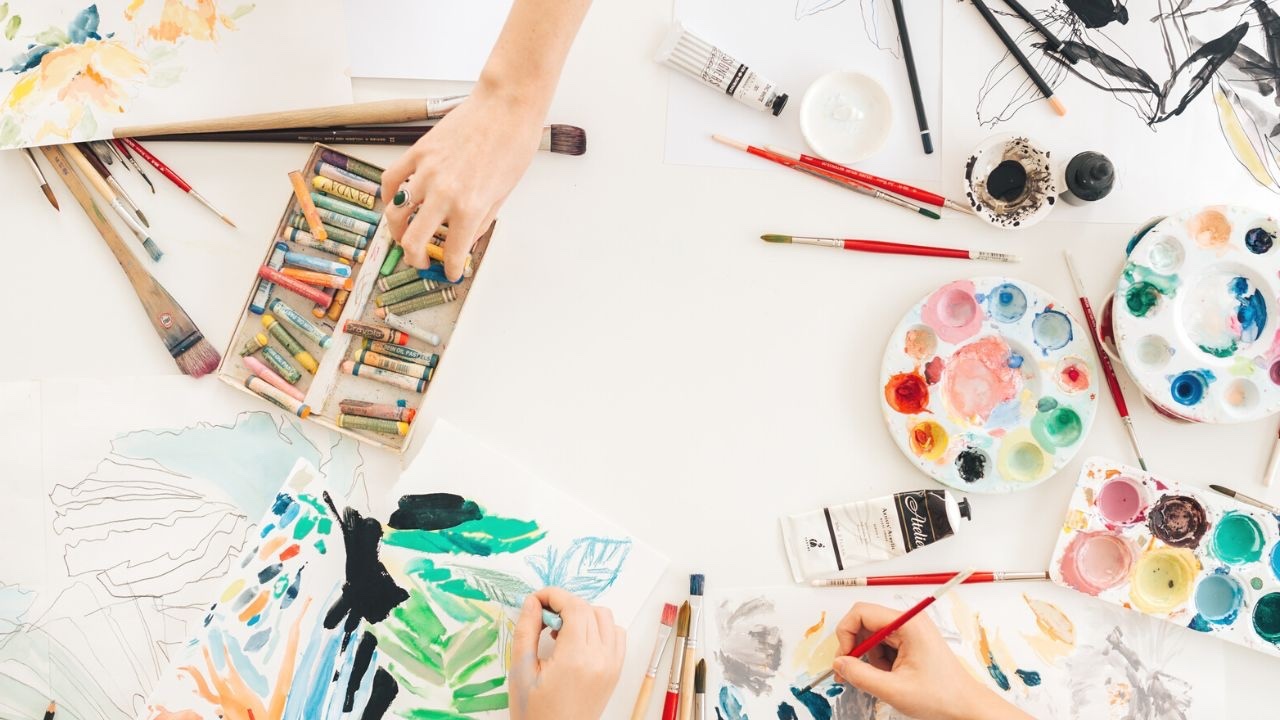
Maximise Your Art Supplies Like a Pro Studio
Apr 04, 2024

5 Secrets for Selling Surface Print Patterns
Apr 04, 2024
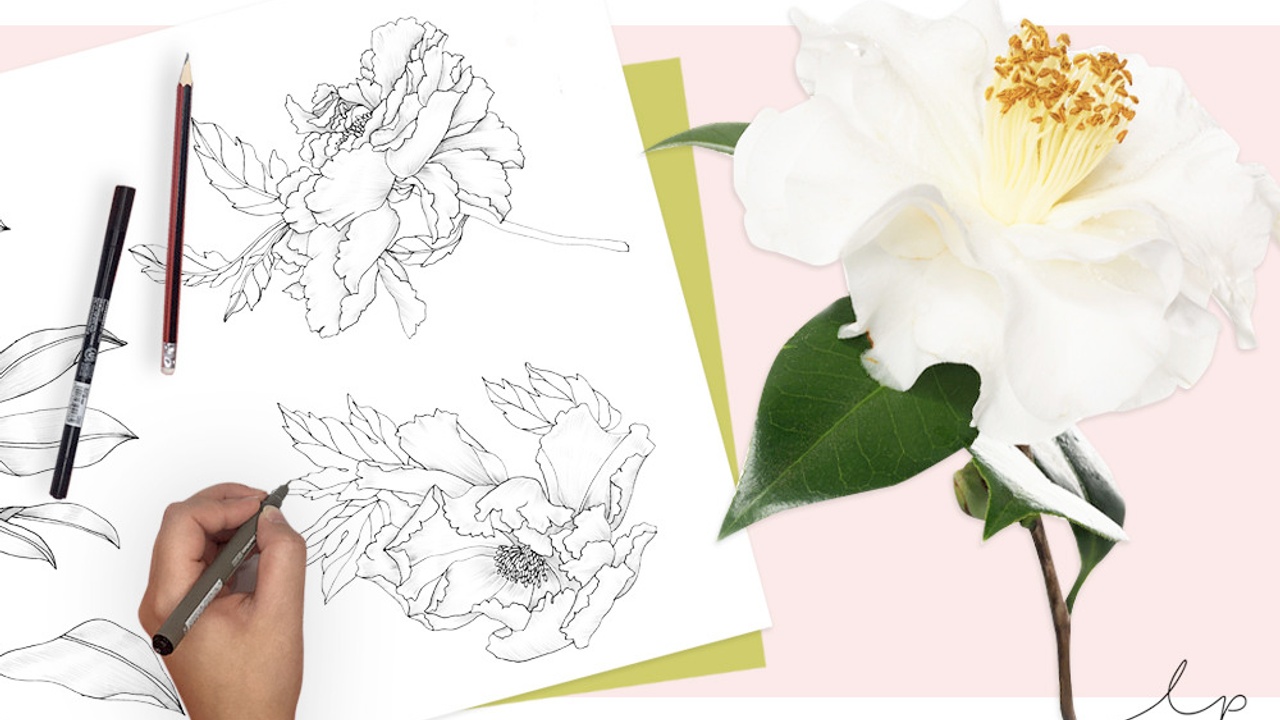
The Key to Drawing Better Blooms
Mar 21, 2024
2 Minute Tutorial: Cut a Scanned Motif Like a Pro
Feb 07, 2024

5 Things to Avoid When Applying for a Design Job
Jan 25, 2024

